
Role UX/UI Expert, then Reviewer, then Super Reviewer
Context Design evaluation for a frontier AI lab, through Mercor Intelligence. The client, the project and the methods are covered by an NDA.
Duration September 2025 to September 2026, remote
Volume Hundreds of interfaces evaluated: landing pages, marketplaces, dashboards, web apps, institutional sites. Over a thousand evaluations by other designers reviewed.
This is about how I work and what I learned.
Taste is contextual, and expertise is being able to explain why
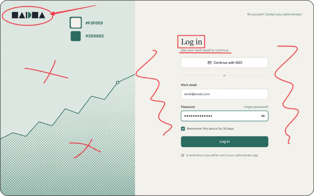
a) The generated interface works well for a financial dashboard login page. The neutral palette of paper, sage and graphite, with a single teal reserved for the primary action and the chart line, establishes the seriousness and sobriety expected of a money-related product, where restraint reads as reliability and the single accent brings direction and certainty. The display serif used for the main heading evokes the authority of financial print, and the geometric sans-serif keeps the body copy clean and precise. The halftone chart follows the same logic, quoting the visual language of newspapers and annual reports. The logo, built from geometric shapes, feels institutional rather than personal, and the generous negative space signals order and control.
b) The generated interface faces several issues as a children’s game login page. The neutral palette isn’t stimulating, as its low saturation carries the opposite of playful energy. The serif heading looks somewhat stern and emotionally distant, and the thin sans-serif is too light to hold a child’s attention. The halftone chart isn’t part of the visual world children recognize, and a rising line means little without the concept behind it. The logo is abstract, with no character to identify with or remember. The excessive negative space fails to provide excitement and offers nothing that invites exploration.
Taste is the result of life experience, collected references and theoretical study. It cannot be reduced to black and white, right or wrong. The useful question isn’t “is this good”, but “is this good here“, for this product, this audience, this purpose.
Anyone can tell you whether something looks good. An expert designer is able to explain why it looks good in this context, in a way that others can understand and check for themselves. It is about translating perception into objective argument.
This project wasn’t about what is good taste. It was about how good taste can be judged at scale.
The example comes before the definition
A definition can be interpreted in infinite ways. Real examples settle ambiguity that no amount of careful prose will. Now, when writing guidance of any kind, I begin with an example and then add the definition.
Separate “I would have chosen differently” from “this wasn’t assessed correctly”
Good evaluation means putting personal preference aside and sticking to method. It is harder than it sounds, because the two feel identical from the inside, and it is a common source of inconsistency between evaluators. When careful people disagree, I look at the question before I look at the people.
Guidance expires, and nobody notices
Documentation written for one generation of a problem gets applied to the next one without anyone deciding to do that. The vocabulary is the same, but what it described has evolved.
Everyone fills the gap with their own assumption, and each individual assumption looks reasonable. So I treat any standing document as something with an expiry date rather than an asset. The question is not whether it is correct, but whether it still stands.
Train people to train people
Broadcasting a standard to a large group achieves very little. What works is going deep with a small number of people who are genuinely engaged, until they can teach it themselves and argue substantively about the standard.
My background in political science had me already interested in how contested judgments get made legibly by groups of people. In this project I got to experience the same problem, with interfaces, and ultimately taste, as the subject.
It taught me about design and about judgment. I now assume any critique I give will be reused by someone who was not in the conversation, because I have seen what happens to a judgment when it has to survive contact with many other people.

